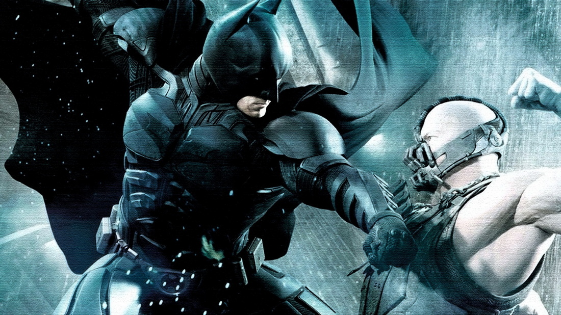
Batman - The dark knight risesIn this title sequence the Warner Brothers logo is shown. This alone will raise expectation surrounding the film and attract people, this is because it is a big brand which has previously had big budget, mainstream films. This will strengthen the films marketability as people who are fans of the brand will automatically be drawn to the film. If the logo wasn't as mainstream and popular, then it may not connote the type of film that the film makers want.
The film is designed for a mass market audience and is an example of a mainstream cinema. The design concept is highly influencial in the marketing sense of the film. The title sequence shows the logo of Warner Brothers throughout to emphasise the nig brand. It also shows all the big actors/actress's names, for example Christian Bale and Tom hardy. These are repeated to increase marketability. People will be drawn to the actors and actress's if not the film. The films post production is important, the title sequence is an influencial part of the marketing, the sequence highlights parts of the storyline and repeatedly shows images relating to The Batman. The sequence shows the directors name many times. Christopher Nolan is a big time director who has directed other big films such as; Inception, Batman the Dark Knight and Batman Begins. The fact his name is repeated throughout the sequence shows he is another key selling point of the film. If the director was less well known its likely his name wouldn't be repeated throughout, because he wouldn't be a selling point. |

|


|
Lock, Stock, and Two smoking barrelsIn this title sequence the SKA films logo title shows what production company created the film and shows that the film isn't going to be a hollywood blockbuster. This gives immediate connotations as to what genre the film will be (British comedy thirller). This helps to create a better brand identity. The titles also show the name of the director (Guy Ritchie who at this point was an up and coming producer of British films. With his name being featured in the titles, people will be drawn to the film to see what he is all about as a new director.
The film is designed for an niche audience. As this film wasn't destined to be a Hollywood blockbuster. The credits that flash up on the screen in the titles are simple, white font on a black background in a typewriter fashion. This is an indicator on the budget of the film, they can also connote what sort of film it will be. Not overly flashy, and full of grit. These were post production effects which were used to give information about the makers of the film. There are also British actors used in the film which can also be a selling point. As Jason Statham and Vinnie Jones both have starring rolls in the film. as well as a cameo from Sting, these all feature on the movie poster as they help as selling points for the film. |
Se7enIn the title sequence, we can see the opening of a notebook, and New Line Cinema shows up on the screen in a type writer font. There is an institutional context created as New Line Cinema has a reputation for making good, high quality films. This helps create a brand identity for them, as they usually cast A-list actors, and this attracts a large audience.
Brad Pitt and Morgan Freeman are A-list actors, and this is used as a main selling point for the movie, showing their names to the audience first. When they are shown, they are the only names on the screen, which tells us that they are important to the story and will be the main characters, who botch usually star in mainstream cinema. Brad Pitt is a young, popular actor at this time, and he would bring a large audience with him to the movie. This is not the genre of movie that he usually stars in, he normally stars in dramas, action films, or comedies. The producers were probably hoping to expand on the genre of cinema that he performs in. Morgan Freeman, on the other hand, usually does star in this type of movie, and he was probably chosen for the role because of this. There is a great deal of editing in this sequence, and I feel the opening relies heavily on it. There are many short shots of various tattered photos, rough metal tools, and a worn notebook filled with crude writing. The man who is handling these things has rough, worn hands with bandages on the tips of his fingers, after we see him shaving the skin of his fingertips. All this creates a very dark and mysterious tone for the film. The title sequence gives the viewer a short view into the world of a serial killer, obsessed with photographs and notes on his victims. All the names of actors and crew that are shown on screen are all written in the same crude, almost child looking handwriting. This creates a sense eeriness around the serial killer that we are shown. |


|
